Shiny!


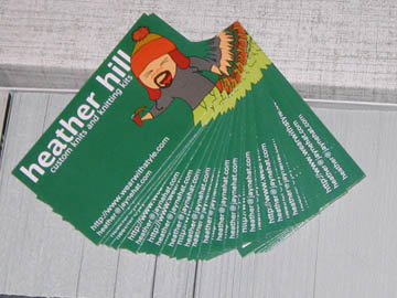
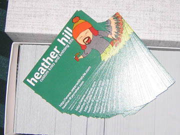
Literally shiny! If this is the matte finish, I’m glad I didn’t go for the UV coating. Also, they extended the left side more than I was expecting. The text as designed by
However! None of that matters, because I’m thrilled with how these turned out. I’m going to be handing these out to random strangers. And, of course, mailing them off to the Serenity screenings that are giving away my hats. Now all I need are care cards and maybe some non-Jayne-specific cards (although maybe not, now that I see these) and I’m good to go!


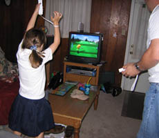
We’ve introduced Emily to the wii. She doesn’t want to play for very long, which is fine with us since we don’t want her hooked on video games. She enjoys making miis (each little person you make to represent you onscreen is called a mii) and seems to be pretty good for her age at golf.
Hmm… golf scholarship… hmm…
and maybe some non-Jayne-specific cards
I’d like to point out that you’re up to result #10 for “nice lady” for regular (american) google search.
and maybe some non-Jayne-specific cards
I’d like to point out that you’re up to result #10 for “nice lady” for regular (american) google search.
DANG but those cards look nice. If I do say so myself
Yeah, for quality printing, everything is a little shiny. Gloss is a risk though, because depending on the exact kind of gloss they use, it can be at the point where you can’t look at it if you’re directly under a light source.
Printing usually only needs 3mm safe space, usually just for if you have a full-bleed background, like these do, or if you have an image that runs off the page. So I guess if you had the ‘heather hill’ butted right up against the edge of the card, you couldn’t lose… you’d either get an itty bit of space between it and the edge, or it’d get chopped off a little bit. I’ll fix those when I attack it next.
Next up: Care cards, general business card (if you have an idea for an alternate image to use for those?) and actually having a stab at that knitted texture background!
DANG but those cards look nice. If I do say so myself
Yeah, for quality printing, everything is a little shiny. Gloss is a risk though, because depending on the exact kind of gloss they use, it can be at the point where you can’t look at it if you’re directly under a light source.
Printing usually only needs 3mm safe space, usually just for if you have a full-bleed background, like these do, or if you have an image that runs off the page. So I guess if you had the ‘heather hill’ butted right up against the edge of the card, you couldn’t lose… you’d either get an itty bit of space between it and the edge, or it’d get chopped off a little bit. I’ll fix those when I attack it next.
Next up: Care cards, general business card (if you have an idea for an alternate image to use for those?) and actually having a stab at that knitted texture background!
Woo hoo! Suck on that, un-nice ladies!
No, wait, I mean… how grand!
Woo hoo! Suck on that, un-nice ladies!
No, wait, I mean… how grand!